4 reasons why we need a new generation of user interfaces

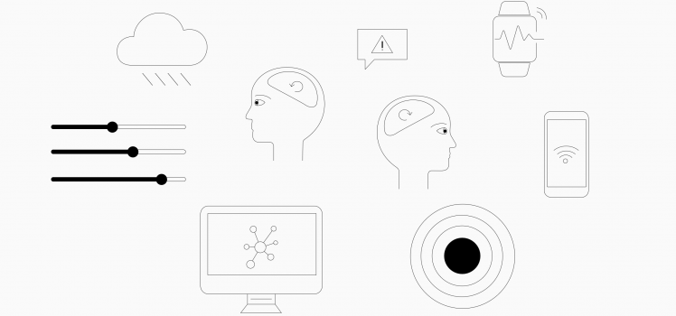
Devices that combine a number of sensory inputs – or engage a sense in an intuitive way – will be the way forward in creating more livable spaces with technology.
New types of interfaces are appearing everywhere. Speech, haptics and gesture are becoming more common everyday – but what is the reason for this shift? How are touchscreens like the smartphone holding us back? Let’s explore 4 big reasons why we need a new generation of ubiquitous user interfaces (UUI).
1. Complexity
Over the past 35 years, personal computers and mobile devices have merged an incredible number of physical products and services into a single generic device – the smartphone.
This change has brought huge benefits in terms of productivity, but also drawbacks in terms of usability. It has required the introduction of menus and graphical imitations of real things, without shape and feel to naturally differentiate them.
Graphical user interfaces require your focus and attention, as well as your willingness to learn and adapt to new structures and ever-changing menus. This is a problem for many people, especially when it comes to extremely simple, creative or mission-critical tasks where you need your attention elsewhere.
2. Speed
One of the most common assumptions is that centralizing tasks and information means greater efficiency for the user. As a result, devices are ruled by menus and folder structures. This approach was carried through to all kinds of applications; including ones that don’t directly require a computer — notably the control of connected devices.
However, complexity and menus mean that it takes longer for you to get to where you want to go. And sometimes, time is a deal breaker.
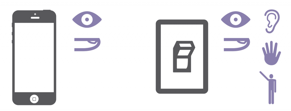
If we look at the light switch example, using the smartphone interface required several steps for operation. These include pulling out your smartphone, unlocking it, searching for the right app and opening it to select the right setting. This process is time-consuming and a step in the wrong direction when compared with the user flow of a traditional light switch.

Turning on a light takes 10 to 15 steps on a smartphone, which translates to about 10–15 seconds including loading times. Imagine yourself waiting inside of a hallway waiting for 15 seconds to see the light come on.
As a result, when faced with using their phone or walking to the wall to hit a light switch — most users will choose the latter –we have even observed this first hand. It’s simply faster, easier and less distracting to flip a switch than scrolling through pages of apps each time you want to turn on the light.
3. Cognitive Load
Spreading cognitive load onto multiple senses means that you can do things without having to think about them. For example, when you hit a light switch, you use your eyes, ears, touch, awareness of positioning and also your motoric memory to perform the activity. On a smartphone, you lose all of that. That is because graphical user interfaces require you to process all information mainly through your eyes and a very reduced version of haptics.

When you check your phone, you mentally have to drop everything else you’re doing — a conversation, a task or a creative process — and channel full attention toward your sense of sight. The ability to focus on “the music rather than the instrument” is a crucial skill and human need.
4. Distraction
The PC was developed with the intention of revolutionizing education and work. With time, things like shopping and social relationships were added. The adoption of the smartphone, a miniaturized version of the PC, meant that you were now carrying all of these applications into your home and your bedroom, including pop-up notifications and constant availability.
Although we constantly feel connected, the overload of digital distractions in our lives is causing us to lose touch with reality. Designing for stickiness can have serious negative side effects such as anxiety, social isolation, lack of empathy. These side effects inevitably impact our health, relationships and society as a whole.
5. Natural Interactions
Ubiquitous user interfaces use multiple senses, inputs and feedback for more natural interactions. Devices that combine a number of sensory inputs — or engage a sense in an intuitive way – will be the way forward in creating more livable spaces with technology.
Battery-free wireless switches for example offer the simplicity of flipping a light switch, but can communicate with your smart devices like Philips Hue the same way that your smartphone does. This means you can take advantage of all the benefits of a smart home without having to use your phone.
See how Nuimo Click gives you simple, intuitive control for your smart lights
6. Battery-free Power for Wireless Switches
Today’s battery-free switches generate all energy required from their environment. An example are wireless switches using the energy harvesting technology developed by EnOcean. Such switches generate their energy from the kinetic motion when being pressed. There are a number of advantages:
- great flexibility when it comes to placing the switch since there is no wiring
- maintenance-free as there is no need to replace batteries
- ready to be used straightaway and increased comfort
Emphasising these advantages, initiatives like the new “Battery-free by EnOcean” seal make branded switches’ benefits visible at a glance.
With the emerging trends in IoT, smartphones will continue to control many areas of our workplaces and homes – however, in many situations a battery-free wireless switch is a far more flexible and user-friendly option.
 Tobias Eichenwald is CEO and Co-Founder of Senic, a Berlin-based hardware startup building the next generation of smart home interfaces and systems. With a background in design, psychology and business, Tobias is passionate about the future of hardware, local manufacturing and creating human-centered experiences with technology.


